Tuesday, April 16, 2013
Evolution Press on KUOW
We recently had the pleasure of showing Katy Sewall, a producer for Weekday around the shop for a segment on the show. We talked about printing with our vintage Heidelbergs and the artistry and craft of being a printer. Take a listen to the show (skip to 16:00 to get to our segment.)
Listen Here!
Labels:
Evan,
Evolution Press,
Katy Sewall,
KUOW,
Scott
Thursday, March 28, 2013
Theo Chocolate Mirepoix box wrap
A while back we worked with Theo Chocolate in their collaboration with FareStart to print the box wrap labels for their mirepoix caramels. Seattle Magazine did a write-up here.
Printing the box wrap was a fun process combining 4-color offset with black letterpress, in some places overprinting. The Reich Savoy paper was wonderful to work with as usual. It prints and scores brilliantly. We had a great time working with the Theo gang, and the process was documented and made into a beautiful little film.
See the film here!
Labels:
box wrap,
Letterpress,
offset,
Reich Paper,
Theo Chocolate
Friday, March 15, 2013
Inspiration: Monocle Section D
Labels:
foil,
inspiration
Tuesday, March 12, 2013
Fluorescent Spring!
Seattle weather in March may be bleak and gray but the ink colors that we're mixing can get lively.
The suite includes an RSVP and directions card (offset) and an invitation (letterpress.)
Here's some fresh work from local designer and friend of the shop, Tara Lee.
The suite includes an RSVP and directions card (offset) and an invitation (letterpress.)
The subtlety in the design is the overprinted detail in the hearts and dots. The colors are over-layed, allowing the slight transparency of the ink to add depth of the piece.
Labels:
118# Savoy,
Letterpress,
Reich Paper,
Tara Lee
Thursday, February 28, 2013
ITAL/C

The gang over at Italic have been sending us some really great projects recently. We've also printed their business cards, which are a nice example of their work. Simple, bold and smart.
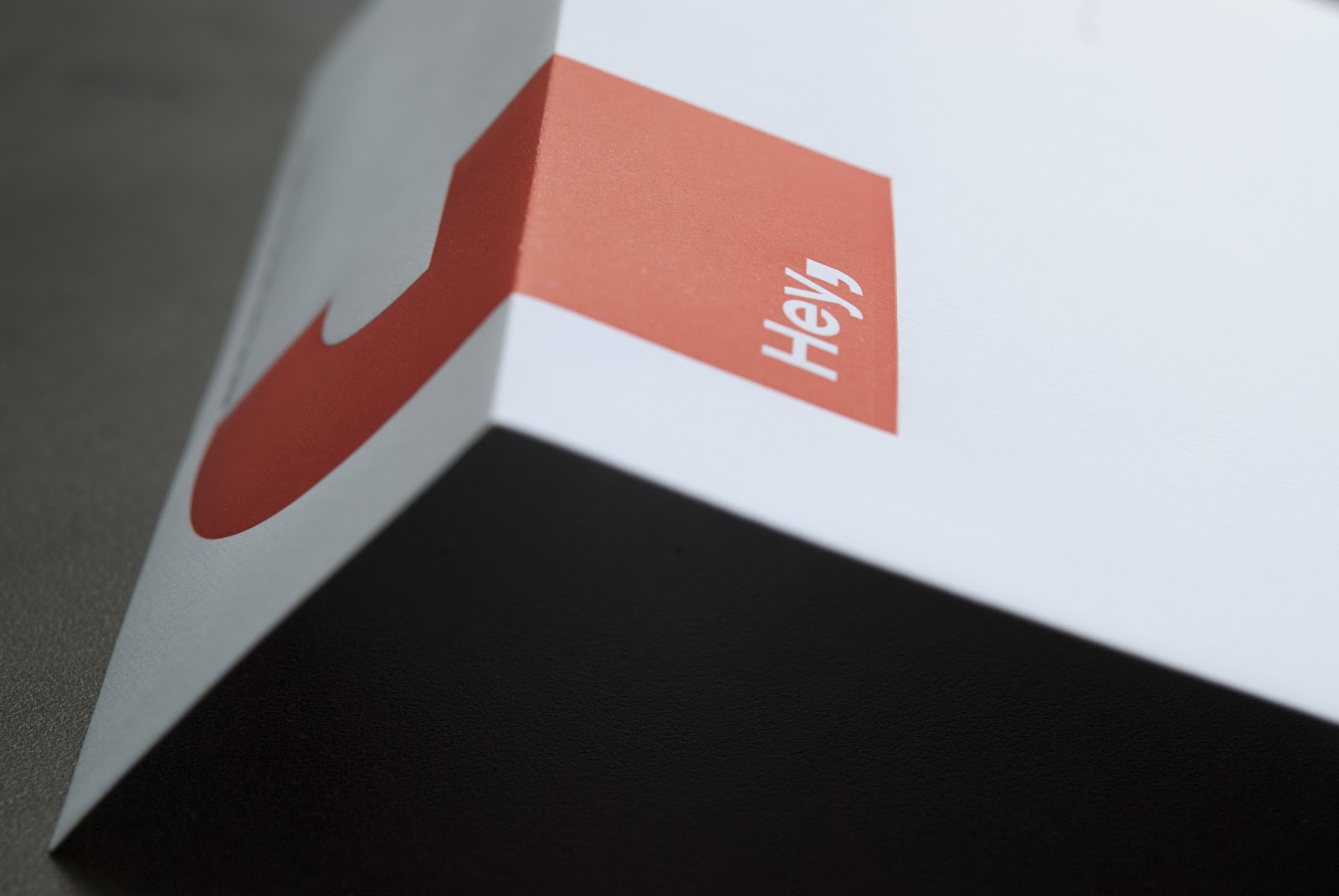
The design lends itself to our production processes wonderfully. They selected a palette of four paper colors that were distributed randomly during the printing. Black letterpress on the front of the card is juxtaposed against the duplexed gray sheet on the back, stamped with white foil. The beauty of duplexing colored sheets is that the cards essentially have a full flood of color on each side without the need for ink, and when the cards are trimmed to size they reveal a crisp pop of color on the edge.
So there you have it. Smart design, three processes and of course, fine printing.
Labels:
duplex,
french paper,
Letterpress,
letterpress and foil
Friday, February 1, 2013
Unintended & Sublime
The Tympan is a waxy sheet that is secured to the platen of a printing press. Along with the packing beneath, it is critical in determining how the artwork looks on the sheet when it is printed. A symptom of letterpress printing with impression is that the Tympan takes quite a beating and it is therefore necessary to replace the Tympan sheet quite often in order to keep every job looking sharp. The old sheets are replaced with crisp new ones and the printing continues.
It's interesting to step back and notice the subtle beauty of the old Tympans. They each have a unique history of use. Some with longer lifespans than others. Enjoy these photos.
As always at Evolution Press, the process is paramount.
![]() |
![]() |
Labels:
Letterpress,
tympan
Tuesday, November 13, 2012
Inspiration: The Savoy Cocktail Book
Hidden under a plain cover is a collection of vibrant prints that frame the recipes in the Savoy Cocktail Book. First published in 1930, these illustrations were likely color separated manually by transparency. This was a transitional period in printing, with CMYK being cost prohibitive for most projects. The Savoy prints are economical and that is what makes them beautiful. The line quality is bold and the use of overprinting to achieve a third color is a technique that is especially refreshing to see.
The moral of the story is that traditional approaches to printing and design can look fresh in the right application.
Subscribe to:
Posts (Atom)
Home |
Letterpress |
Offset Lithography |
Our Process |
The Shop |
The Blog |
Specs |
Contact Us
© Evolution Press Incorporated. All Rights Reserved.


