Evolution Press, Inc.
http://www.facebook.com/pages/Evolution-Press/192396720774521
LetterpressOffset LithographyOur ProcessThe ShopSpecs

Friday, February 25, 2011

Nordstrom's PONCHO

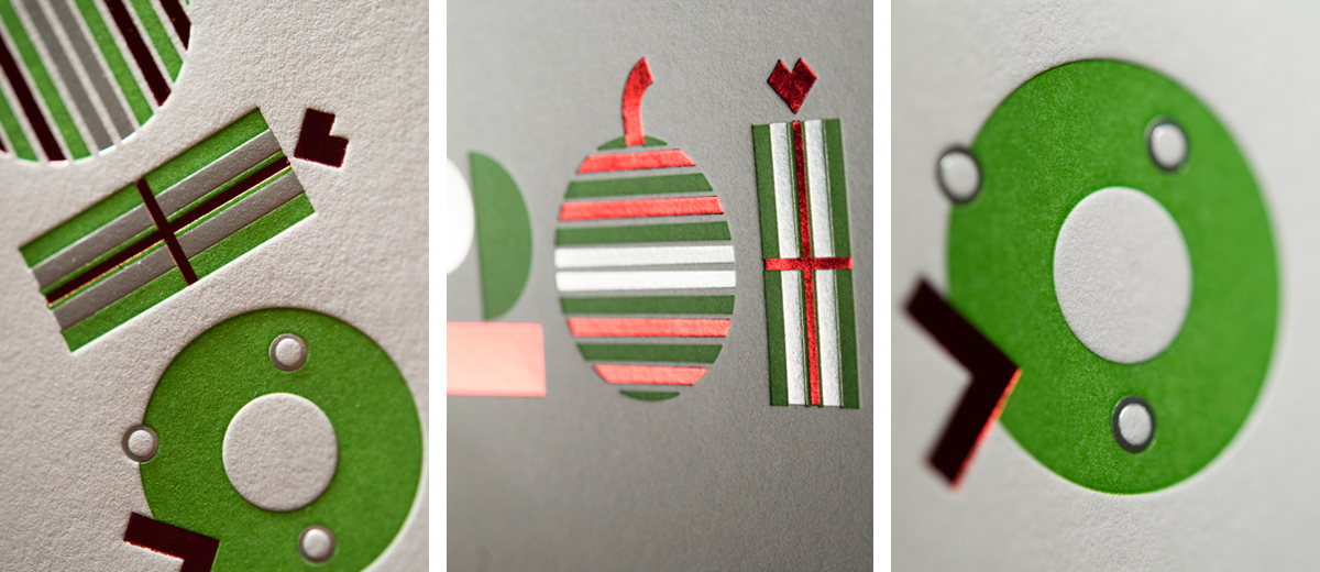
Nordstrom Marketing designed this exclusive invitation for Poncho and we think it has the WOW factor a deboss can deliver.

To ensure maximum deboss WOWness for the logo we went with a copper die, which has very hard chiseled edges that allow for a super clean impression. Paper was also key: something too light would tend to buckle, so we used Savoy 236# cover from Reich Paper. 236# Savoy is super heavy and is 100% cotton, this was the first job run on the new 236# Savoy cover and we were really impressed how it absorbed the deboss strike.

Friday, February 11, 2011

Still Liquor


A clean yet bold business card designed by Javas Lehn. The use of visually appealing sans serif type and an iconic black vehicle rendered through letterpress gives this card a clean and textural appeal.
Eskaboard is FSC Certified and sturdy. Letterpress printing on Eskaboard gives this card a vintage feel.

Thursday, February 10, 2011

Innovation

Innovation was well represented on this dramatic card design created by our friends at Graphiti Associates. The paper needed to standup to Five passes so for stability our choice was 179# Crane’s Crest Cover. First, they went through our Offset Press for a flood with reversed out type. We then had the cards laser cut. After that, they were letterpress printed 2 colors and diecut to add the final touch of rounded corners. 

Tuesday, February 8, 2011

Geometrically Pleasing

TKTJ Design chose wisely when creating this geometrically pleasing farewell to twenty-ten. There is a unique balance that comes from the combination of Foil and Letterpress techniques. Here the impression created   turns negative space into competing shape and form on the page. The paper 118# Savoy by Reich Paper is our choice for pieces that fold, it doesn't crack on the score, which helps achieve a clean look.  Savoy was  
 also key in getting the desired dimensional look. 100# cotton means paper with soft flexibility, and looking at these photos you can see - and almost feel - the texture. Utilizing color, technique, and materials makes this piece really stand out.

Luxurious

TKTJ Design combined two print methods to achieve this luxurious card on 110# Crane’s Lettra cover. First we letterpress printed the tree line art in cool grey 11 and then added the subtle coverage of pearl foil. The ability to combine two print methods under one roof gave TKTJ Design the creative freedom to obtain both the unique coverage of foil stamping and the deep impression of letterpress, all under a tight holiday deadline.

Elegant Party Accents

Nothing enhances a celebration quite like a collection of letterpress printed Drink Coasters.  This featured collection was designed and printed in-house, with the festive holiday spirit in mind.  We chose 220# Crane’s Crest 100# Cotton paper for its stability and thickness.  At double the weight of their standard 110# sheet, the letterpress impression is especially emphasized with depth and texture.  In addition to its soft look and touch, Crane’s Crest 220# has stability, which is especially important for a Coaster project.

The darker paper used was Eskaboard – a heavy duty kraftboard that has the appearance of chipboard, but with more sturdiness and a more calandered surface area. Eskaboard – like 220# Crane’s Crest – has the ability to stand up to the demands of use and handling, while retaining a luxurious look and feel.

Friday, February 4, 2011

Texture, texture, texture!

Here at Evolution Press we believe there is a fine line between fashion and print. Where there is form, texture, and color, there is inspiration.
Since the invitation for The Bravern’s event Fashion's Night Out uses color and texture, our client, Square Tomato, wanted a premium paper that would show off their design.  They chose 179# Crane’s Cover in Fluorescent White - a hefty cotton sheet that provides great stability for multiple press runs.  First, we laid the Spot colors down on our offset press.  Next, we debossed both sides of the sheet -including the fine texture of a woman’s scarf and the top of her couture gown- which created a voluptuous, tactile look.  The final touch came when we die-cut the card to give it its elegant, rounded corners.  It's the fine detail that makes this piece not just unique but a stand-out.


Wednesday, February 2, 2011

Love What You Do


How did you kick off the New Year? Here at Evolution Press, we wanted to do something extra special to thank our much-loved creative clients for a great year. So we took the opportunity to collaborate with Todd Karam at TKTJ Design to create a one-of-a-kind calendar.

The paper – Savoy #118 cover in brilliant white from Reich Paper – was our #1 choice for this piece. Savoy's calendared surface makes for minimal paper fiber shed, keeping the offset-printed solid colors clean and crisp. Given the malleable softness of this 100% cotton sheet, the emboss, deboss, and letterpress elements all have optimum visual effect.

We are thrilled with the end result. Reich Savoy #118 cover provided an excellent surface for us to execute Todd’s inspired creative design work, and allowed our press skills to shine: a great way to start the New Year. Happy 2011!


Home  |  Letterpress  |  Offset Lithography  |  Our Process  |  The Shop  |  The Blog  |  Specs  |  Contact Us
© Evolution Press Incorporated. All Rights Reserved.