Evolution Press, Inc.
http://www.facebook.com/pages/Evolution-Press/192396720774521
LetterpressOffset LithographyOur ProcessThe ShopSpecs
Showing posts with label letterpress and foil. Show all posts

Thursday, February 28, 2013

ITAL/C


The gang over at Italic have been sending us some really great projects recently. We've also printed their business cards, which are a nice example of their work. Simple, bold and smart.

The design lends itself to our production processes wonderfully.  They selected a palette of four paper colors that were distributed randomly during the printing.  Black letterpress on the front of the card is juxtaposed against the duplexed gray sheet on the back, stamped with white foil. The beauty of duplexing colored sheets is that the cards essentially have a full flood of color on each side without the need for ink, and when the cards are trimmed to size they reveal a crisp pop of color on the edge.

So there you have it.  Smart design, three processes and of course, fine printing.


Wednesday, June 1, 2011

SVC Wayzgoose Invitation

For those of you who do not know, the School of Visual Concepts graciously hosts an Annual Wayzgoose Celebration.  Events in the past have included a Letterpress Equipment Swap, tables of letterpress deliciousness for sale, and –the MAIN EVENT- a Steamrolling Smackdown Print Extravaganza! 
Much to our joy, we just completed the coveted SVC Wayzgoose invitations. Letterpress printed, gold foiled and diecut to a vintage ticket shape all on luscious Reich Savoy 236# Cotton.
Designed by Jenny Wilkson.

Tuesday, February 8, 2011

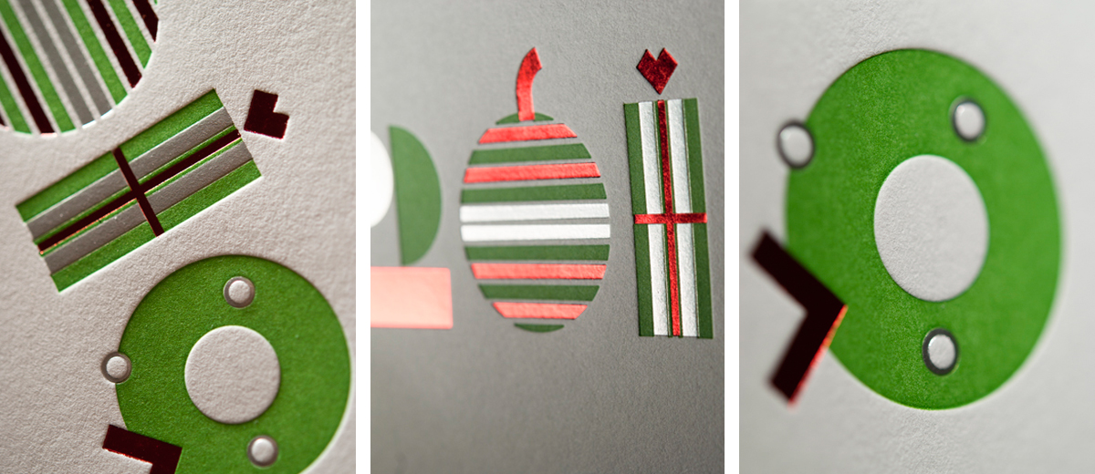
Geometrically Pleasing

TKTJ Design chose wisely when creating this geometrically pleasing farewell to twenty-ten. There is a unique balance that comes from the combination of Foil and Letterpress techniques. Here the impression created   turns negative space into competing shape and form on the page. The paper 118# Savoy by Reich Paper is our choice for pieces that fold, it doesn't crack on the score, which helps achieve a clean look.  Savoy was  
 also key in getting the desired dimensional look. 100# cotton means paper with soft flexibility, and looking at these photos you can see - and almost feel - the texture. Utilizing color, technique, and materials makes this piece really stand out.

Luxurious

TKTJ Design combined two print methods to achieve this luxurious card on 110# Crane’s Lettra cover. First we letterpress printed the tree line art in cool grey 11 and then added the subtle coverage of pearl foil. The ability to combine two print methods under one roof gave TKTJ Design the creative freedom to obtain both the unique coverage of foil stamping and the deep impression of letterpress, all under a tight holiday deadline.

Home  |  Letterpress  |  Offset Lithography  |  Our Process  |  The Shop  |  The Blog  |  Specs  |  Contact Us
© Evolution Press Incorporated. All Rights Reserved.