Evolution Press, Inc.
http://www.facebook.com/pages/Evolution-Press/192396720774521
LetterpressOffset LithographyOur ProcessThe ShopSpecs

Thursday, March 28, 2013

Theo Chocolate Mirepoix box wrap

A while back we worked with Theo Chocolate in their collaboration with FareStart to print the box wrap labels for their mirepoix caramels. Seattle Magazine did a write-up here.

Printing the box wrap was a fun process combining 4-color offset with black letterpress, in some places overprinting. The Eames paper was wonderful to work with as usual. It prints and scores brilliantly. We had a great time working with the Theo gang, and the process was documented and made into a beautiful little film.
See the film here!


Thursday, February 28, 2013

ITAL/C


The gang over at Italic have been sending us some really great projects recently. We've also printed their business cards, which are a nice example of their work. Simple, bold and smart.

The design lends itself to our production processes wonderfully.  They selected a palette of four paper colors that were distributed randomly during the printing.  Black letterpress on the front of the card is juxtaposed against the duplexed gray sheet on the back, stamped with white foil. The beauty of duplexing colored sheets is that the cards essentially have a full flood of color on each side without the need for ink, and when the cards are trimmed to size they reveal a crisp pop of color on the edge.

So there you have it.  Smart design, three processes and of course, fine printing.


Wednesday, November 7, 2012

iJet Onboard

The folks at iJet Onboard wanted a business card that would stand out.  With the combination of offset printing, letterpress, and a die cut, they certainly got one.  Notice the subtle gradient in the halo.

Thursday, July 19, 2012

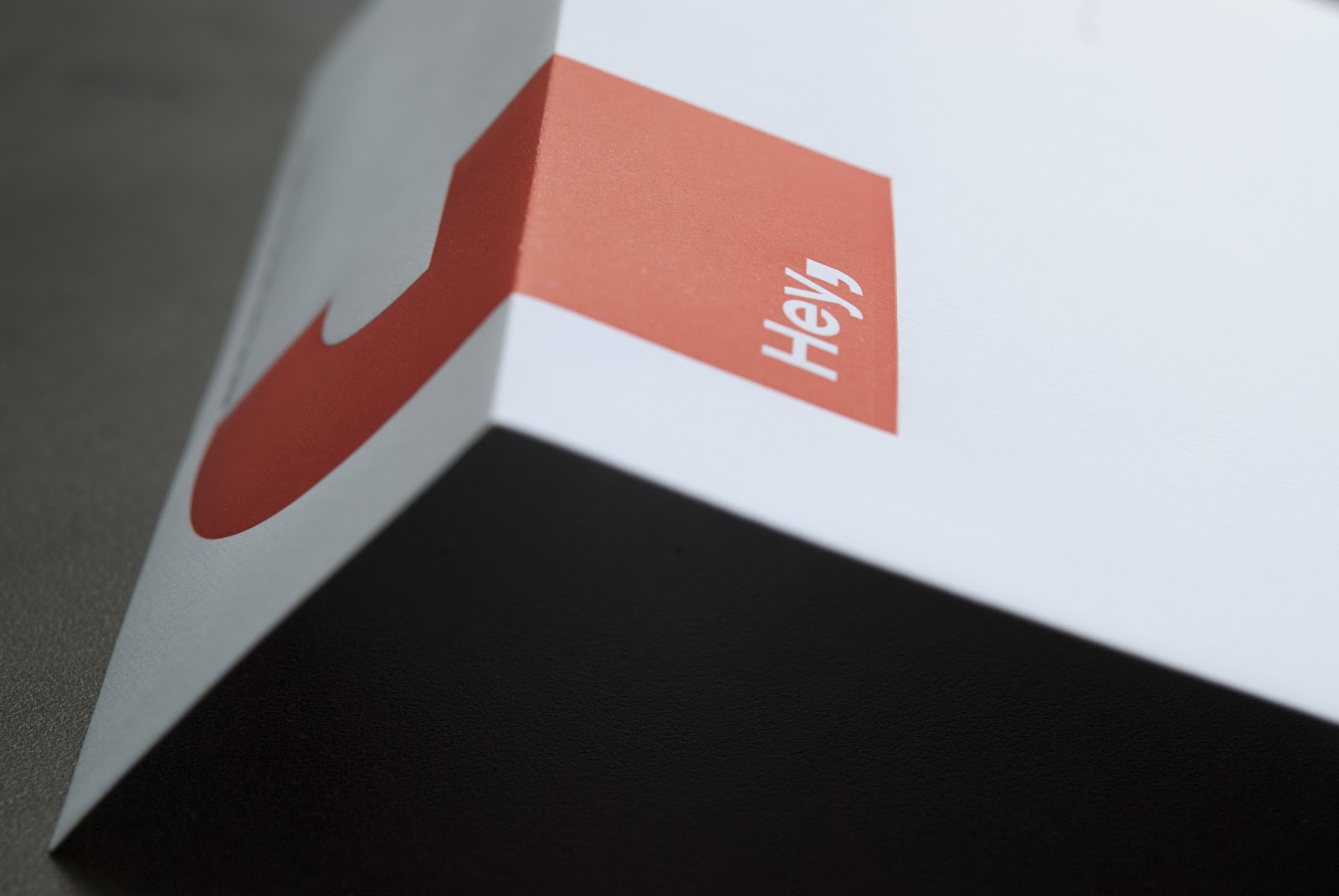
Hey envelope

A smart use of letterpress on a pre-converted envelope. With there cool design Hey was mindful with the position of their logo making sure it printed off the seams avoiding the cost of a post converted envelope.

Horseshoe Business Card

Chipboard is no longer relegated to the back sheet of a note pads and being 100% recycled we use it for all sorts of projects like folders, hang tags, packaging and business cards. We really like this 2 color letterpress business card designed by Jenny Wilkson for Horseshoe Boutique that includes a super cool die-cut.

Monday, April 23, 2012

Jeff Brink Business Cards

The architectural lines are letter-pressed to provide a both impression and elevation within the soft cotton stock. Production included offsetting pms 2965 on179# Cranes Crest, the architectural lines were letter-pressed in pms 2965 and followed up with a foil pass in matte silver. The flip side of the card was letterpress in pms 2965 and pms 877 with a final treatment of silver gilding.

Tuesday, March 6, 2012

Eddie Bauer Bookmark

To create a nice heavy sheet that could standup to letterpress and foiling without bruising we duplexed 120# Eames Painting Cover to 80# Classic Crest canyon brown cover. The Eddie Bauer logo was foiled with clear foil and the copy side was letter-pressed in a custom brown to match the canyon brown stock, followed up with die-cutting the bookmark was then carefully hand assembled with custom orange eyelets and leather cord.

Friday, February 17, 2012

Patrick Kehoe, Still and Motion Pictures


Still and motion photographer Patrick Kehoe recently contacted Evolution Press for some fine letterpress business cards and after meeting with Patrick and learning that he was also a storyteller who produces short narrative documentaries, so we ended up filming his cards running on press.
Apart from being a pleasure to work with, Patrick has a true sense for his craft impressing us with his keen eye and editing style-- and hey now he has some sweet cards to boot!.

Check it out

Monday, January 16, 2012

Binary Anvil Business Card

 Foil stamping is an impressive way to obtain striking opacity on colored paper.
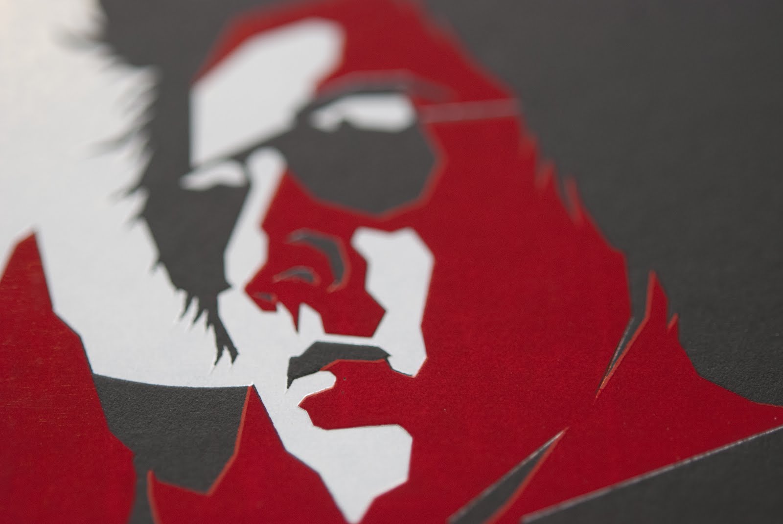
Using 200lb thick black vellum stock, the red was foiled first as a solid circle. On the next pass, the black image was foiled exactly on top to build the logo image. Precision press work is required when layering colors like this, and when done well, the end result is seamlessly striking.

Monday, November 7, 2011

Turnstyle Identity


Sophisticated thoughtful design enabled Turnstyle to deliver a sharp new Identity.
On the Business Card the logo side is foiled with gloss black foil and the contact info side letter-pressed black and red. The final treatment was gold leaf gilded edges, all on 236# Reich Savoy, oh yes these cards feel good in the hand!.
Also featured are the #10 envelopes, letterpress address block and foil logo with a custom die-cut flap on Eames Painting Vellum White Text.


Tuesday, September 6, 2011

Jamie Joseph Custom Packaging

This beautifully elegant packaging project -custom designed and custom made for Jamie Joseph jewelry- incorporates Foil stamping, registered emboss, die cutting, and final assembly.  Combining foil with  registered emboss gives the splash of gold incredible visual impact, as it rises up from the page. In contrast with the visual effect often achieved through engraving, the foil/registered emboss process gives a greater deboss on the other side of the sheet.  Classic, elegant, and unique.
Executed using Mohawk Superfine Eggshell Cover, a durable,attractive, and pleasant sheet to work with. 

Friday, September 2, 2011

Evolution Press Coaster Project

A personal project of ours, this 4 Coaster Set with custom packaging was designed, printed, and assembled in house. Inspired by historical printer's marks and bookplates, the Evolution Press coasters were done in a limited edition run, and were being given away at our Annual Picnic this year.  The entirety was produced on Reich Paper, aside from the brown coaster backing.
The coasters were letterpress printed on double thick paper, which we duplexed in house, to give them that luxurious yet durable look and feel.  Custom packaging is something we love working on, and so this was an exceptionally satisfying project for us to work on.

Thursday, August 11, 2011

Evolution Press Picnic, August 2011


We here at Evolution Press like to celebrate warm summer days when we can – which isn’t often in Seattle.  Last week, we threw a Company/Client picnic, featuring catering by Skillet Street Food and Parfait Organic Ice Cream.  The weather was amazing, the food was delicious, and it was truly a treat to take some time out to spend with our much-appreciated clients and friends.

We had West Coast Paper, Neenah Paper and Reich Paper representatives join us, with swatch books on hand.


In the shop, we had on display a collection of archival linocut posters from the Annual SVC Steamroller Print Exhibit. The 10th annual Wayzgoose is coming up on SAT. AUGUST 27, 2011
from 1–6 PM at  the School of Visual Concepts, and is not to be missed. Free and open to the public.


Bunny Hang Tags


These adorable paper bunny hang tags came to us via Amy Redmond. They were produced for Kata Golda, an artist who works primarily producing hand sewn felted children’s toys, books, and accessories.  The use of letterpress and 100% cotton paper fit perfectly with Kata’s aesthetic, which features handcrafted detail and craftsmanship.

The bunnies were first letterpress printed on 236# cotton Reich Paper and then die cut into the whimsical bunny shape.  They are two-sided and feature a hole at the top of the bunny ear, which was created with the die cut press pass. This hole will be used to pass ribbon or twine through. This piece went through 3 passes total. Post print production, these bunnies were clothed in felt, and hand sewn with an initial on the front by Kata Golda.

Friday, July 29, 2011

Robert Bennett Business Card


Robert Bennett’s business card utilized a variety of print methods.  The bold U, which takes center stage on the card, is die cut out, creating not only an iconic logo, but a useful tool; the business card can now be used as a bookmark.

Printed on Eames Natural White Cover, with letterpress printing on one side and offset printing on the other, we think these business cards are sturdy, useful, and most importantly, memorable.

Friday, June 3, 2011

Gregory Henn Business Card


Gregory Henn business card showcases a cool artistic design by Ryan Clark of Invisible Creature. One of the things we love most about this business card is the clever use of negative space.  Clark did a great job incorporating red and white foil on 141# Black Curious Skin paper. By using bold shapes and color, the negative space utilizes the high contrast of the black paper to create a 3rd dimension.  This design displays a perfect use of the chosen materials and print method.  Ryan Clark says, of the design: "The inspiration was old movie posters with a modern twist".  Well done!


Wednesday, June 1, 2011

SVC Wayzgoose Invitation

For those of you who do not know, the School of Visual Concepts graciously hosts an Annual Wayzgoose Celebration.  Events in the past have included a Letterpress Equipment Swap, tables of letterpress deliciousness for sale, and –the MAIN EVENT- a Steamrolling Smackdown Print Extravaganza! 
Much to our joy, we just completed the coveted SVC Wayzgoose invitations. Letterpress printed, gold foiled and diecut to a vintage ticket shape all on luscious Reich Savoy 236# Cotton.
Designed by Jenny Wilkson.

Wednesday, May 25, 2011

Seattle Symphony Split Fountain


Last week we put our split fountain pants on and printed the Seattle Symphony Closing Night Invitation Symphonys Iwona Konarski worked closely with Evolution to assure the design delivered the correct blend and balance of colors. We enjoyed the spontaneous process, and love the result!

Wednesday, April 27, 2011

James Beard Menu


Subtlety can have a big impact in print. James Beard utilized sophisticated detail to make this special occasion menu stand out.  The palm border was created with a blind deboss which adds varying degrees of dimension and detail, and is combined with letterpress in a cool teal shade to add the feel of tropical elegance.

We chose 118# Savoy Natural White for this piece for its softness and malleability. 100% cotton makes this paper a great medium for the impression of deboss and letterpress.


Wednesday, March 16, 2011

Parfait Labels

Graphiti Associates worked to develop a cost-effective label that still reflected the high quality, hand made nature of the Parfait product and brand.

When designing a label for a truly 100% organic artisan ice cream maker, you can't help but want it to reflect the quality of the product. We not only wanted everyone to know that Parfait makes everything completely from scratch but also that their jar had been hand sealed by the owner, Adria Shimada, herself.

In order to convey this to the customer, we incorporated an elegantly custom die-cut label that when applied creates a physical seal between the lid and the jar. Production at Evolution was achieved by printing a flood of orange with type reversed on stick and peel label stock followed up with a pass of brown foil for the bold graphics that are modern and simple with a  final kiss-cut pass to create the unique label. If you haven’t already, be sure to check out Parfait’s Organic Artisan Ice Cream, served fresh from her truck throughout the summer months. Or, if you're like us, ice cream isn't just for summer - so check out her home delivery service offered now!
Home  |  Letterpress  |  Offset Lithography  |  Our Process  |  The Shop  |  The Blog  |  Specs  |  Contact Us
© Evolution Press Incorporated. All Rights Reserved.