Evolution Press, Inc.
http://www.facebook.com/pages/Evolution-Press/192396720774521
LetterpressOffset LithographyOur ProcessThe ShopSpecs

Friday, July 29, 2011

Robert Bennett Business Card


Robert Bennett’s business card utilized a variety of print methods.  The bold U, which takes center stage on the card, is die cut out, creating not only an iconic logo, but a useful tool; the business card can now be used as a bookmark.

Printed on Eames Natural White Cover, with letterpress printing on one side and offset printing on the other, we think these business cards are sturdy, useful, and most importantly, memorable.

Friday, June 3, 2011

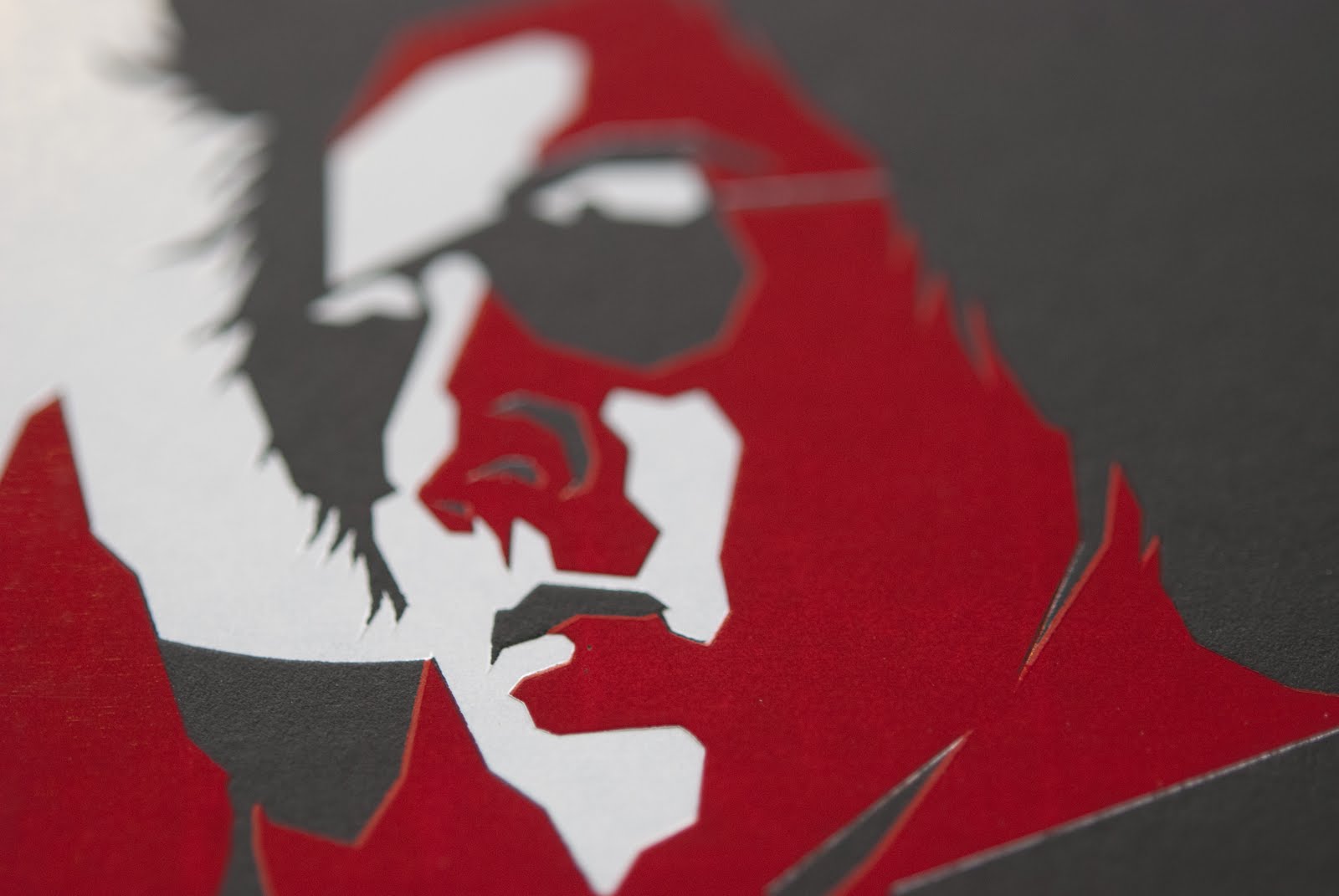
Gregory Henn Business Card


Gregory Henn business card showcases a cool artistic design by Ryan Clark of Invisible Creature. One of the things we love most about this business card is the clever use of negative space.  Clark did a great job incorporating red and white foil on 141# Black Curious Skin paper. By using bold shapes and color, the negative space utilizes the high contrast of the black paper to create a 3rd dimension.  This design displays a perfect use of the chosen materials and print method.  Ryan Clark says, of the design: "The inspiration was old movie posters with a modern twist".  Well done!


Wednesday, June 1, 2011

SVC Wayzgoose Invitation

For those of you who do not know, the School of Visual Concepts graciously hosts an Annual Wayzgoose Celebration.  Events in the past have included a Letterpress Equipment Swap, tables of letterpress deliciousness for sale, and –the MAIN EVENT- a Steamrolling Smackdown Print Extravaganza! 
Much to our joy, we just completed the coveted SVC Wayzgoose invitations. Letterpress printed, gold foiled and diecut to a vintage ticket shape all on luscious Reich Savoy 236# Cotton.
Designed by Jenny Wilkson.

Wednesday, May 25, 2011

Seattle Symphony Split Fountain


Last week we put our split fountain pants on and printed the Seattle Symphony Closing Night Invitation Symphonys Iwona Konarski worked closely with Evolution to assure the design delivered the correct blend and balance of colors. We enjoyed the spontaneous process, and love the result!

Wednesday, April 27, 2011

James Beard Menu


Subtlety can have a big impact in print. James Beard utilized sophisticated detail to make this special occasion menu stand out.  The palm border was created with a blind deboss which adds varying degrees of dimension and detail, and is combined with letterpress in a cool teal shade to add the feel of tropical elegance.

We chose 118# Savoy Natural White for this piece for its softness and malleability. 100% cotton makes this paper a great medium for the impression of deboss and letterpress.


Wednesday, March 16, 2011

Parfait Labels

Graphiti Associates worked to develop a cost-effective label that still reflected the high quality, hand made nature of the Parfait product and brand.

When designing a label for a truly 100% organic artisan ice cream maker, you can't help but want it to reflect the quality of the product. We not only wanted everyone to know that Parfait makes everything completely from scratch but also that their jar had been hand sealed by the owner, Adria Shimada, herself.

In order to convey this to the customer, we incorporated an elegantly custom die-cut label that when applied creates a physical seal between the lid and the jar. Production at Evolution was achieved by printing a flood of orange with type reversed on stick and peel label stock followed up with a pass of brown foil for the bold graphics that are modern and simple with a  final kiss-cut pass to create the unique label. If you haven’t already, be sure to check out Parfait’s Organic Artisan Ice Cream, served fresh from her truck throughout the summer months. Or, if you're like us, ice cream isn't just for summer - so check out her home delivery service offered now!

Friday, February 25, 2011

Nordstrom's PONCHO

Nordstrom Marketing designed this exclusive invitation for Poncho and we think it has the WOW factor a deboss can deliver.

To ensure maximum deboss WOWness for the logo we went with a copper die, which has very hard chiseled edges that allow for a super clean impression. Paper was also key: something too light would tend to buckle, so we used Savoy 236# cover from Reich Paper. 236# Savoy is super heavy and is 100% cotton, this was the first job run on the new 236# Savoy cover and we were really impressed how it absorbed the deboss strike.
Home  |  Letterpress  |  Offset Lithography  |  Our Process  |  The Shop  |  The Blog  |  Specs  |  Contact Us
© Evolution Press Incorporated. All Rights Reserved.